Be careful with charts
I found around a blog by Professor Richard Jones, touching some themes I like.
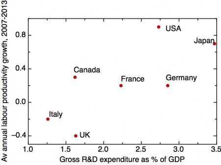
There was something that I didn't quite like: he presents us with the chart below, which is misleading. The post in which he presents the chart is this: Innovation, research and development, and the UK's productivity crisis - part 1.
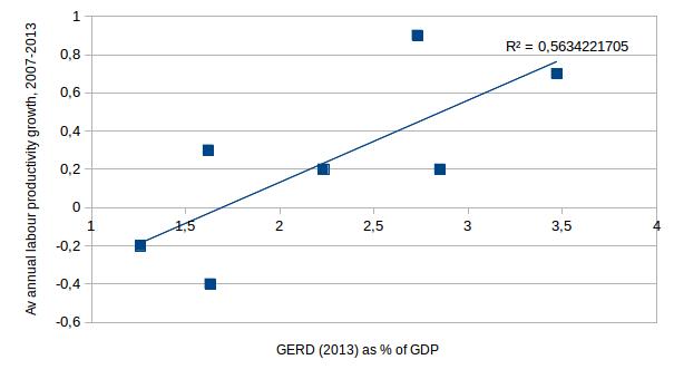
The problem is that when you go to his sources, which he gladly provides as you can check in his site, or here (OECD Productivity) and here (OECD GERD), and plot his data you get this:
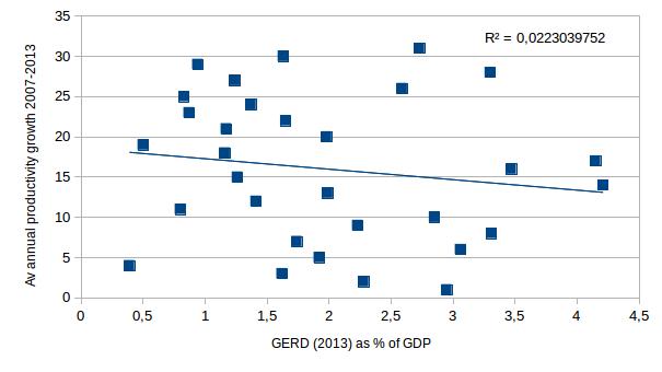
But when you plot the whole thing, and not only his G7 countries, you get this:
You may now say that I am being unfair, because the G7 countries have something that makes then different from the rest in a way that in those countries, more R&D lead to more productivity. Well, if we use GERD in 2007 instead of 2013 (And given that the causal link would be R&D->productivity, it is more plausible to use 2007 GERD to measure 2007-2013 growth than the GERD at the end of the period, (the one that Jones uses!) we get this chart for his G7 countries:
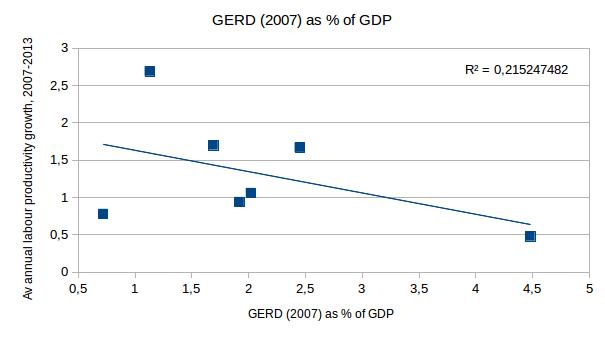
Would you infer that increased R&D causes decreased productivity? I hope not. Yet if this is the case, you shouldn't also infer that based only in the data presented in the first chart. So what is the first chart good for, if we know that it isn't a faithful indicator of reality? Maybe as an stylized illustration of how things usually are. But if this is the case, you don't draw a chart with sourced precise numbers, you draw a 45º line and write the axis titles in the plot, or just say "R&D causes productivity", or something like that.
Professor Jones has a paper here based on some of his blogposts, and he didn't include this chart (maybe because he knows what we made explicit here), as it wouldn't be proper to use something so incomplete in a formal paper.
I just wanted to point out this to make two points on charts and causality using this chart as an example, the purpose of this is not to criticize. One is that a chart might seem very compelling, yet it can be incomplete and therefore misleading. Suppose I make a chart with some countries that happen to have a negative relationship that year (like in 2007). Then, I would use that as "proof" that R&D decreases productivity. The internet is full of these kind of things, of people who (unlike Jones) deliberately attempt to misguide their readerships into believing something via cherrypicking.
And that brings us to point two: What is the actual relation between R&D and productivity, and how do we know? And what is more, what are the global determinants of amount of innovation? And its relation to productivity? And its relation to R&D spending?
This issues are less easy to spot, and they seep into academic papers, published even in top peer-reviewed journals. Someone makes a model, tests it, and if p<0.05, you get to say that this causes that. But what about the dataset? And the controls used to account for variations on other parameters? And the parameters used to try to explain the facts? What if there are confounders, and something that causes private R&D also causes public R&D, instead of one causing the other, or being independent?
One needs first to think about this before trying to quantify reality. To develop a model of the interplay of the relevant variables present in R&D, and then quantify them. This model would have variables like the amount and sectoral composition of R&D, the private/public composition, the number and distribution of researchers in society, number of patent and scientific articles, the cognitive capacity of both the general population and the so called smart fraction, etc. I will think about this, and maybe draw a nice chart with a proposal for such a model at some point.
Citation
In academic work, please cite this essay as:
Ricón, José Luis, “Be careful with charts”, Nintil (2015-09-01), available at https://nintil.com/a-chart-on-rd-and-productivity-reviewed/.
Comments